How to Choose the Best Fonts for Game User Experience
In an intense game, an important discussion suddenly happens, but it’s difficult to read the subtitles due to the small font blending in with the background sounds. It is annoying and takes away from the sense of togetherness in the situation. Fonts used in gaming are more significant than the language they convey. The attraction of your game is not only based on its visuals; they also influence how players view it.
Let’s dive into the technical considerations of font selection in video game development, focusing on types, accessibility, efficiency, and practical implementation.
1. Font Types: Key Considerations for Design and Readability
Different types of fonts serve distinct purposes in game design. Here’s an overview of the most common categories:
- Serif Fonts: Serif fonts, like Times New Roman and Georgia, have decorative strokes (serifs) at the ends of characters. These fonts convey a classic, traditional feel, making them suitable for games with historical or narrative-heavy themes.
- Example: The Witcher series uses serif fonts to reinforce its medieval, immersive world.
- Sans-Serif Fonts: Sans-serif fonts, such as Arial and Roboto, are clean and modern, without any additional strokes. They offer better readability, especially for smaller text or UI elements that need to be quickly processed.
- Example: Overwatch uses sans-serif fonts to ensure fast readability in a fast-paced gaming environment.
- Display Fonts: These are highly decorative fonts designed to attract attention in short bursts, like in logos, titles, or headlines. However, they are not suited for body text or subtitles.
- Example: Cuphead’s retro 1930s cartoon design is enhanced by its use of bold, vintage display fonts.
- Monospaced Fonts: Monospaced fonts have uniform character spacing, which is often used for technical, minimalist, or retro themes.
- Example: Papers, Please uses monospaced fonts to reflect its bureaucratic, dystopian setting.
2. Accessibility: Ensuring Inclusive Gaming Experiences
Font selection plays a crucial role in making games more accessible to a wider audience, including players with visual impairments or reading difficulties like dyslexia.
- Dyslexie Font: A notable example of accessibility-focused design, Dyslexie is specifically tailored to help individuals with dyslexia differentiate between characters that might otherwise appear too similar, reducing reading fatigue.
- Example: Games can incorporate Dyslexie font to improve readability for dyslexic players, offering font customization options that enhance accessibility.
Additionally, ensuring fonts are scalable and providing options to adjust text size and contrast can significantly improve the overall user experience, especially for players with visual impairments.
3. Dynamic Fonts: Flexibility and Scalability Across Platforms
Dynamic fonts—such as TrueType (TTF) and OpenType (OTF)—are scalable, ensuring consistency in appearance across various screen sizes and resolutions. Their widespread support makes them ideal for games that need to run across multiple platforms.
- TTF (TrueType Fonts): TTF fonts offer high compatibility and good scalability across devices and platforms. Their wide support makes them an ideal choice for UI text and in-game dialogues that need to maintain clarity.
- Example: League of Legends utilizes TTF fonts to ensure clear, readable text on both low- and high-resolution displays.
- OTF (OpenType Fonts): OTF offers additional typographic features, such as ligatures and alternate character sets, providing enhanced visual effects. This makes OTF an excellent choice for text-heavy games with cinematic storytelling.
- Example: The Witcher 3 leverages OTF fonts to enhance its narrative through polished text presentation.
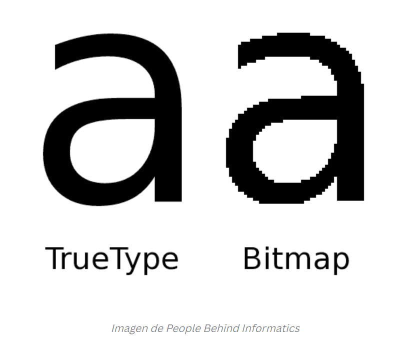
4. Bitmap Fonts: Optimized for Pixel-Based Games and Performance
Bitmap fonts are raster-based and non-scalable, designed at a fixed resolution. These fonts are highly efficient in terms of performance, as they are pre-rendered, requiring fewer resources from the CPU and GPU during gameplay. This makes them an excellent choice for low-resolution or pixel-art games where visual integrity and performance are key.
- Example: Undertale uses bitmap fonts to match its retro pixel-art aesthetic, ensuring the text aligns perfectly with the pixel grid while optimizing performance.
Efficiency Consideration: Bitmap fonts are generally more efficient due to their pre-rendered nature, allowing the game to avoid the real-time rendering overhead seen with dynamic fonts. However, they lack scalability, meaning they can become blurry or distorted when resized.
5. Performance Trade-Offs: TTF and OTF Efficiency
While dynamic fonts (such as TTF and OTF) provide flexibility for text scaling across devices and platforms, they do come with performance costs. Because these fonts are rendered in real-time, they require more CPU and GPU resources, particularly in games with dynamic UI elements or when scaling text for different resolutions.
This trade-off is important to consider, especially for mobile games or games with limited system resources, where real-time font rendering can impact performance.
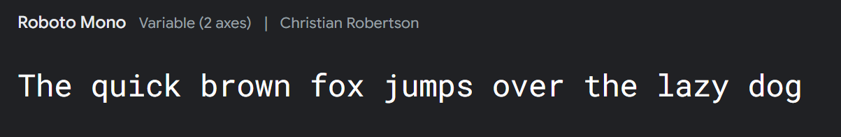
6. Google Fonts: Open-Source and Easily Integrated
For developers looking for reliable, high-quality fonts, Google Fonts offers a vast library of over 1,000 open-source options, available for free.
- Advantages: Google Fonts are highly versatile and come with permissive licenses, making them usable for both personal and commercial projects. They are also optimized for use in web and mobile applications, making them simple to integrate into game engines.
- Example: Google Fonts can be used for UI, menus, and in-game text without licensing concerns, offering flexibility for indie developers and large studios alike.
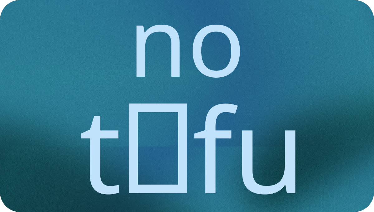
7. Noto: Universal Font Support for Multilingual Games
As games continue to expand into global markets, supporting multiple languages becomes a necessity. Noto, a font family developed by Google, supports nearly every written language, ensuring text displays correctly in any script.
- Use Case: Noto ensures that games localized into languages like Chinese, Arabic, and Cyrillic can present text clearly and consistently.
- Example: Noto is particularly valuable for mobile games or large-scale RPGs, where seamless localization is critical for reaching international players.
Conclusion
Choosing the right font for video games is more than just about looks; it also impacts readability, accessibility, performance, and cross-platform compatibility. Through understanding trade-offs and utilizing tools like Google Fonts, developers can enhance game performance and inclusivity, delivering a seamless and enjoyable gaming experience for players of varying languages and devices.